Color & Composition


AN ILLUSTRATION STUDY:
What’s the difference between those two illustrations?
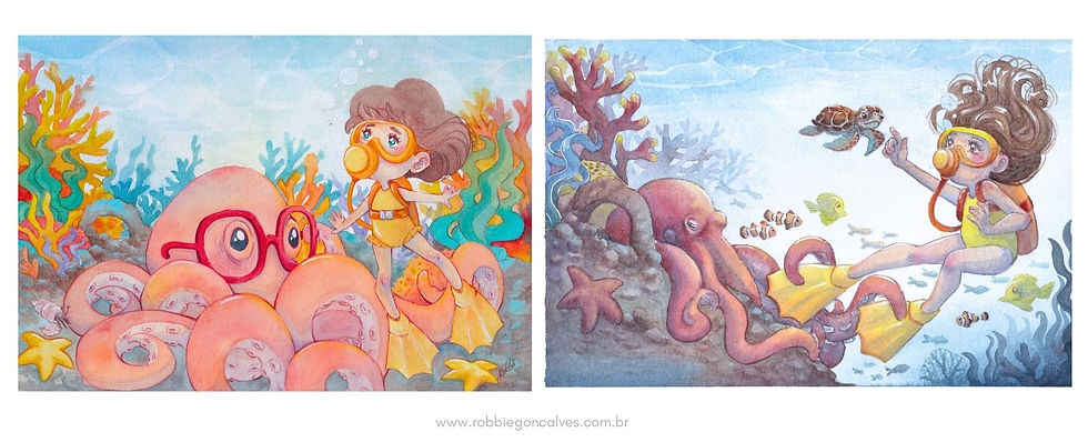
I'm not talking about style. I'm talking about COMPOSITION.
Let’s check the 4 main parameters:
Orientation;
Colors;
Depth;
Storytelling.
ORIENTATION:
Here we have so many different directions that doesn’t make any sense.

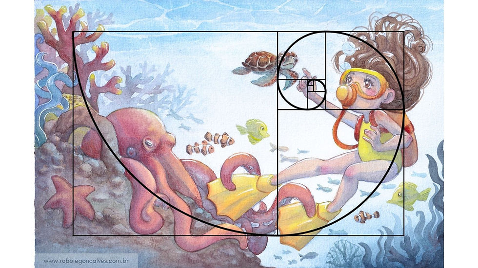
A good illustration guides the eyes of the reader where you want them to look.
COLORS & DEPTH
Can you cleary see the backgroung and the foreground of this illustration?

No, It’s not clear. All the colors are flat and there’s no sense of depth.
The lack of shades of transparency and shadows make it all confusing.
And you can notice some strange position of some elements that feels odd due to the lack of depth and shadows of colors.

Transparency and color gradients can improve the sense of depth.
Here you can cleary notice the foreground and the background.

STORYTELLING
What the illustration tells you?

There’s an octopus wearing glasses (for what reason?).
Is the girl looking up just floating or she’s scaping?
The characters are just there, not interacting to each other. They don’t tell me a story.
And now, what the illustration tells you?

Here your eyes can follow a story: The girl is diving and gets distracted by the baby turtle while the octopus is curious about her yellow diving fin. Thats the story.
Now I can ask: What’s going to happen when she notices the octopus?
And that’s the illustration talking to you.
That's the basic steps of analysing or planning an illustration.
Now you’re ready to see the difference a good composition does to an illustration.

“And after drawing comes composition. A well-composed painting is half done.” - Pierre Bonnard
Thank you for reading.
Love, Robbie.


Comments